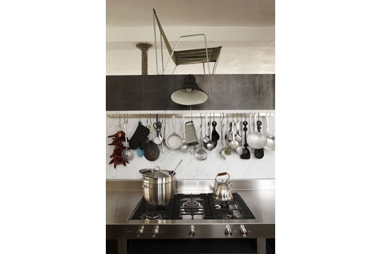
I remember reading years ago (I think Gwyneth said it) that she always went darker as she went down in her outfits. She did so because it gave an elongated look. I have found myself following this rule (except for nude shoes...especially great nude heels) and it rings true for me.
I didn't realize how much I love this in interiors. I find it all over my home and throughout my files.

image and design from Tracery Interiors, Rosemary Beach home
I find myself thinking about this kitchen all the time!
I find it so spectacular in its simplicity. And the stools
make this space. I really am not a fan of these stools alone
but any other type of seating would take away from this seamless
brown bottom and seamless white top of the room. The ceilings, albeit
high already, just look crazy high now with the all white (minus the awesome,
singular beam).
another example:

oh, I love the white & black & brown!
Here are more images that speak to me:


Cottage Living Magazine


how fun is this one?
unknown source

This is the kitchen from Cottage Living's Idea House (2008?)
Again, I love the dark green bottom with dark countertop, contrasting
with the all white wall paint, open shelving and white bowls and serving
dishes. If the shelves or the bowls were any other color, I don't think
they could pull this off. Wooden or iron shelving would have
stolen the show from the backsplash.

This image from Country Living really needs no explanation. Do you
find it as beautiful as I do? One of the top 5 all-time images in my files, for sure.
You take away the white uniformity, the brown chairs or the black cloth....and it
wouldn't work for me. They all need each other to balance. Even with all
this white, I still find this room playful, timeless and striking. I know I have said this
before, but truly monochrome collections and backdrops act as canvases for
the rest of the room.
I am basing the inspiration for my downstairs office on this image. I'll take some befores
and hopefully afters this month!!
An inspiration photo for the downstairs bath's
renovation had this theme as well:

myhomeideas.com
I kept coming back to this one.
Here is the translation:


Boy, it is tough to shoot a bathroom shot! I need to get
someone to take a good one of this room.

I find the same light-to-dark in our guest bedroom
(which has already changed since this photo)
I am realizing how much I love black...but I do
love it tempered with white.

in bathrooms...
(myhomeideas)

in hallways...

Elle Decor
And finally, I see this throughout the stylings of Atlanta Bartlett's
spaces....she is sooo good.

I have a fun week planned for y'all! Some guest
posts later in the week...
I hope Monday is kind to you. Julie